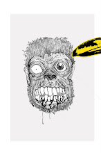
For my brand/logo I wanted to design something nice and simple, I had some ideas of doing in completely in black and white. However I also wanted it to be interesting and not plain, saw some images I liked mainly because of the colour scheme and also because of the content:


I find the style of these images very interesting as some are very detailed and well structured, they are also eye-catching, even though they are in black and white. I want mine to be as noticeable and to include the same levels of detail and structure.
I remembered a nice drawing of a revolver that I used for my morph project in year 1 which would fit in nicely with my current ideas. So I scanned the image and imported it into Illustrator where I went over the line work, to make it stronger and more bold. I can't really remember how it came about but I decided to mirror the guns which led to my final design of adding nice patterns and a sugar skull from the day of the dead festival in Mexico. I drew out the design of the skull in pencil then imported it into illustrator where I went over the line work in a similar process to the gun. I had to think of a name for my brand, I thought six shooter would be a fitting name due to the content of the brand and also because I like the film:). Anyway here is my design:


LOOKS GREAT
ReplyDelete